Battle of Product Filter Navigation: Macys vs. Shein
Who has the superior eCommerce filters?
by Jess Erdman, Content Marketing LeadMarch 2022

Who has the superior eCommerce filters?
by Jess Erdman, Content Marketing LeadMarch 2022

March Madness is around the corner, and we thought–what better time to put product filter and search tools to the test? We’re on the search for the perfect t-shirt for March Madness–sporty, comfortable, and flattering.
The test: We’re going to put 3 different product filter and search tools head-to-head, to see the results.
We’re going to see how Shein, Macy’s, and YesPlz AI compare, using the criteria that we gathered from the best pieces of UX advice from around the web.
But first, before we dive in, let’s make sure we’re aligned on what makes a great product filter.
Not all product filters are great–in fact, many of them leave users dissatisfied and frustrated.
We gathered information from The Good to create the ultimate product filter checklist.
The key takeaways:
1- No fashion jargon: users don’t want to engage with complex fashion terminology;
2- Offer thematic filters: thematic filters are becoming more and more popular;
3- Show key product specifications: users want to see key product specs such as color, sleeve length;
4- Easy navigation: users need a way to easily navigate through the filters with clear cues;
5- Advanced search interface: as users become more sophisticated, they also want to see a more advanced search interface (such as different filters for mobile at desktop).
Are you looking for the full checklist of what makes a great product filter? Click here to download the Product Filter Checklist.
The language of product filters should be easy enough that anyone can understand them, even without a background in fashion. Unfortunately, fashion is one of the areas in eCommerce that is most prone to complex jargon because of changing trends and regional differences in language.
The two easiest ways to avoid jargon are to:
1- make sure that the language you’re using isn’t industry slang
2- use visual cues to accompany text filter descriptions
For example, if given the choice between calling a product a “scoop neck” or “crew neck,” it’s more likely that shoppers would instantly understand “scoop neck.” As a rule of thumb, the less confusing, the better.
Of course, it’s inevitable that some language is inescapable–and if that’s the case, you can accompany the text filter with a small visual cue to guide the shopper, such as the one below:
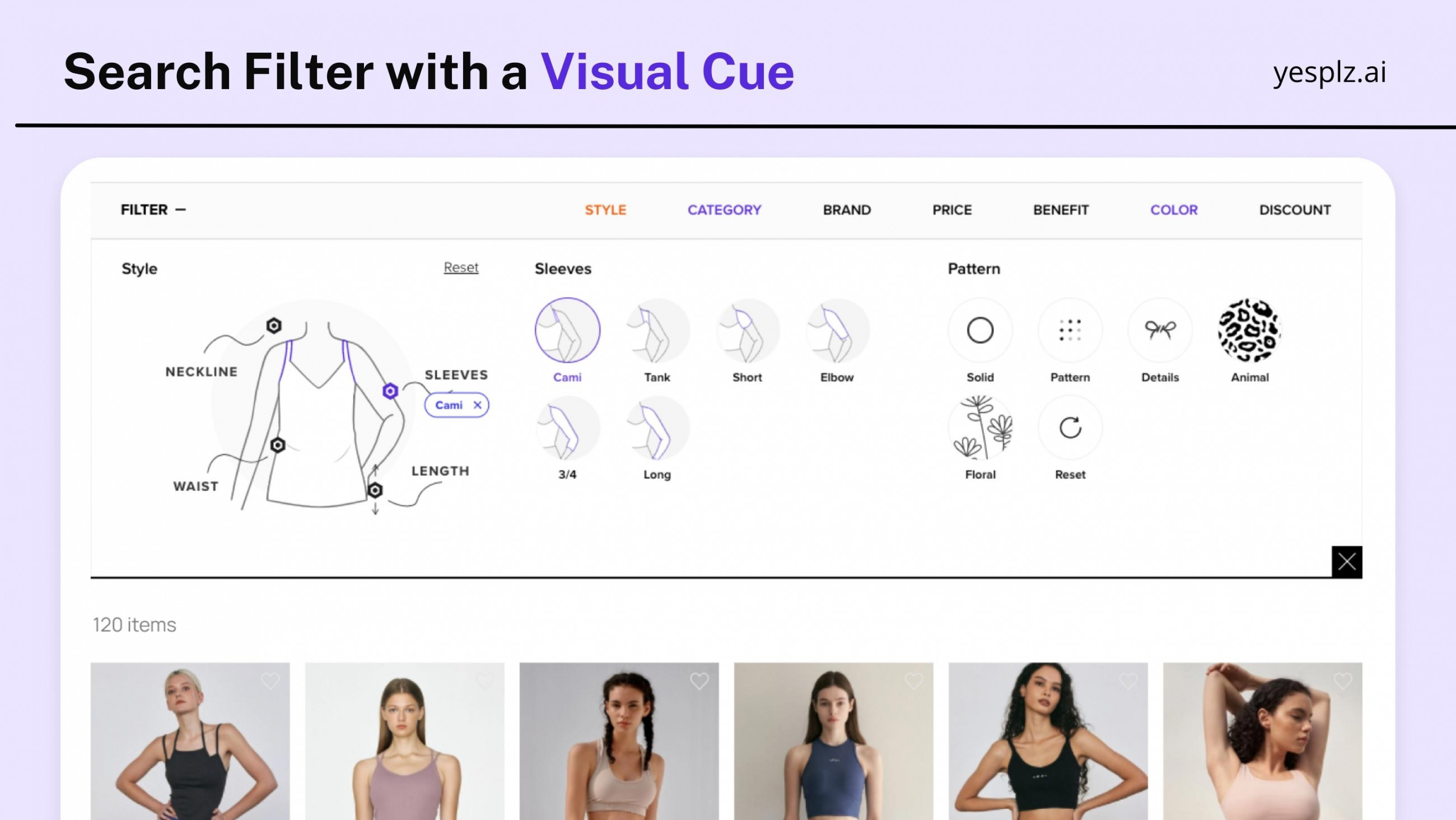
Let’s see how well Shein, Macy’s, and YesPlz approach the “no fashion jargon” rule when searching for a March Madness t-shirt:
In our search for a March Madness t-shirt, we navigated to women’s t-shirts, and saw the following options for neckline (among other search parameters):
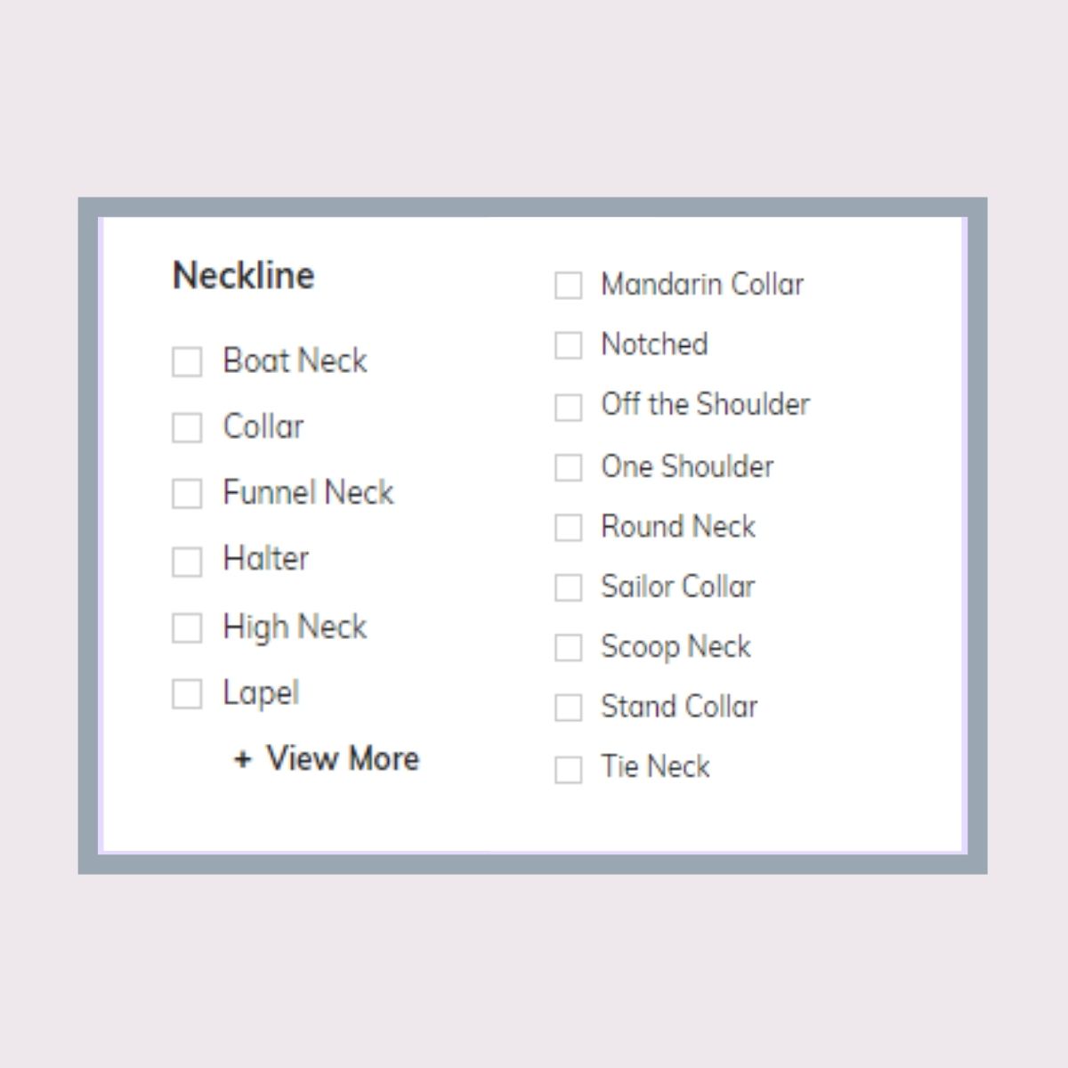
There are many options for shoppers to select from, and nearly every type of neckline style is covered. However, the language used can be difficult for shoppers to understand. For example, a “mandarin collar” versus “notched” neckline is not language that most shoppers can easily understand without a visual cue.
Fashion eCommerce brands should look to use the same language that their customers use when describing products (staying away from industry slang).
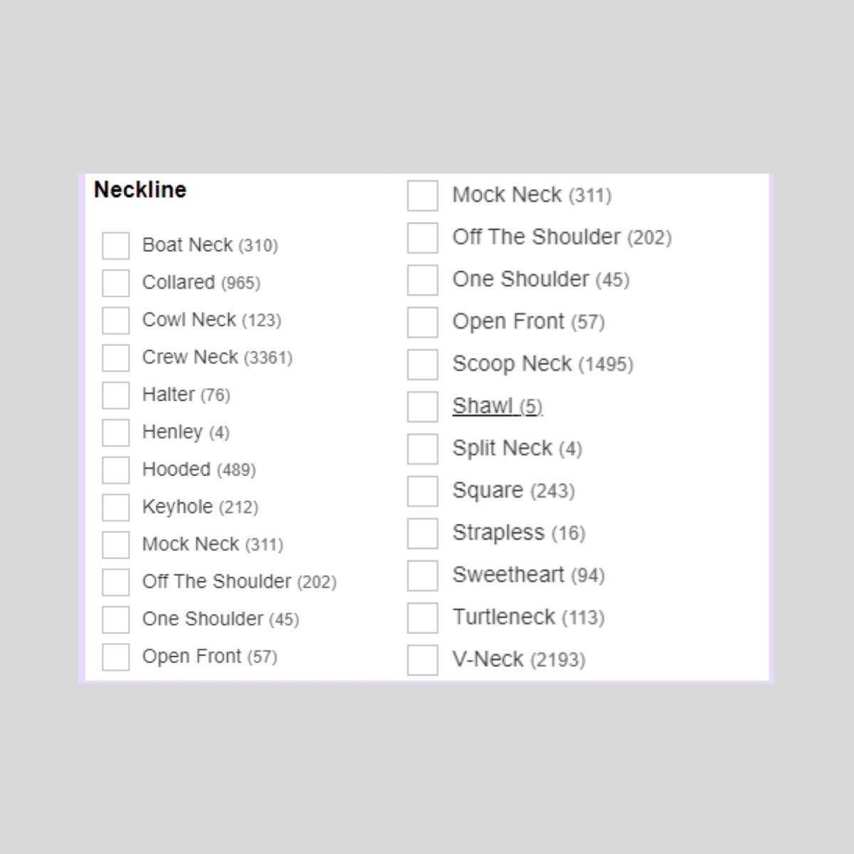
At Macy’s, search filters included a comprehensive list of neckline options. However, the filters are extremely text-heavy, forcing the user to read a long list of descriptions.
The language used in the product filters is difficult to understand for some options–for example, a “split neck” or “sweetheart” neckline are very specific terms.
In addition, some items such as “boat neck” and “scoop neck” may be interpreted to be the same–by including a visual cue next to the product filter (and combining some of the categories), Macy’s could guide users more easily.
The parentheses next to the text include the number of products that will show up with each search, a helpful guide for users that don’t want to be surprised if they only receive 3 search results.
Lastly, we used YesPlz AI product filter and search to find a March Madness t-shirt.
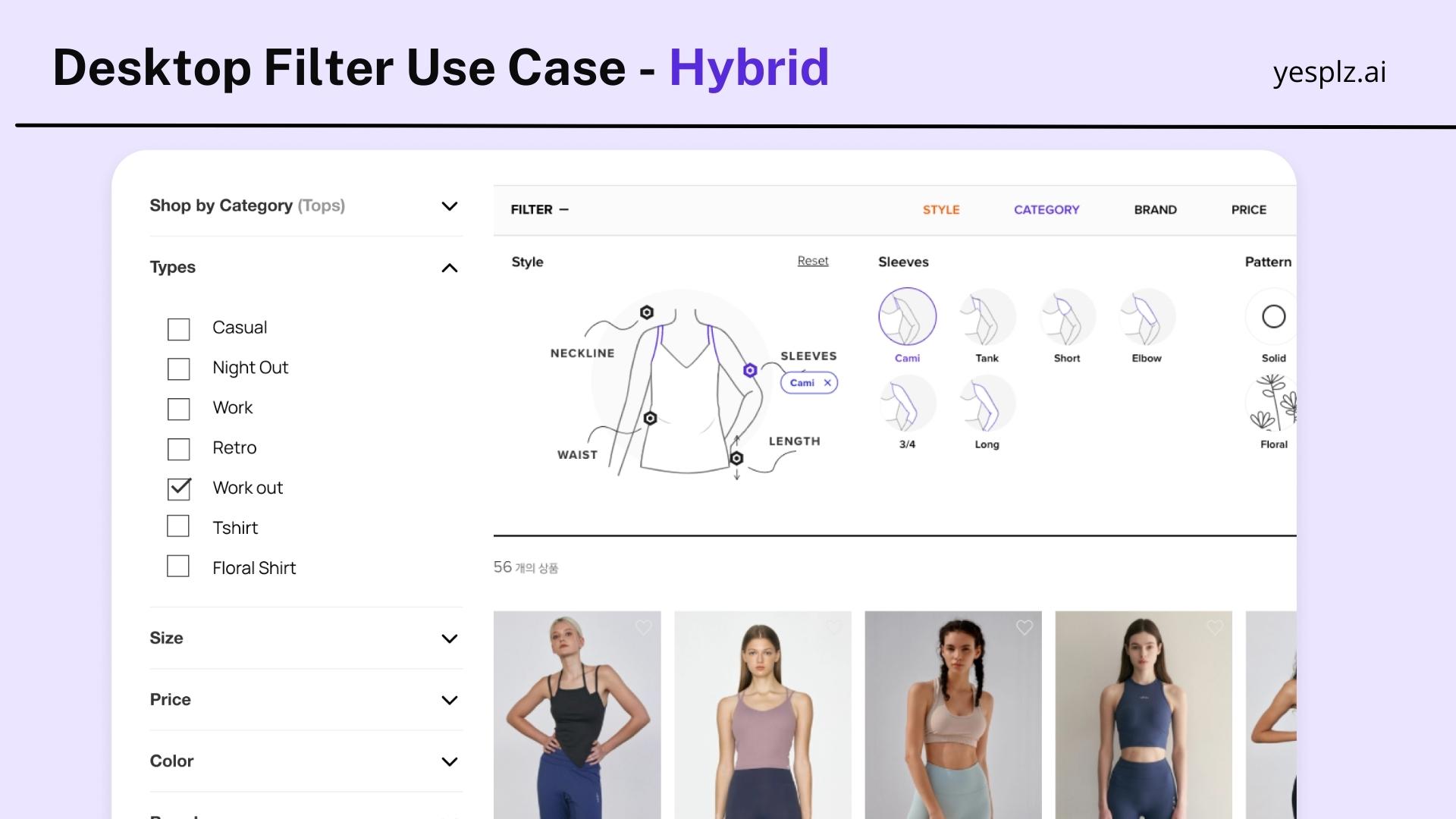
The filter language is specifically selected to be understandable for users, avoiding long lists and fashion industry jargon.
There are also small icons (visual cues) that accompany the text filters, to ensure that users can understand each filter option.
More advanced users may want to see more filter options–however, it’s crucial to balance the needs of the majority of users versus advanced users. In general, users want to see summarized, easy-to-understand filter options versus a long list of filter options that include industry slang.
Effective fashion search makes the user journey as easy as possible.
Read more about how we can solve the problems of traditional product filters.
Thematic filters are important because they give users the opportunity to quickly narrow down their searches, getting users to their desired products faster.
An example of a thematic filter could include an occasion or style (such as “romantic” or “boho”).
Why do 20% of sites lack thematic filters, even if they provide clear value to shoppers?
Thematic filters require retailers to manually tag their product catalogs, making it a labor-intensive and expensive task. And, thematic filters are dependent on a fashion eCommerce’s catalog, as well as user preferences.
For example, an eCommerce that is selling jackets will want to break down the jackets by season. A large dress catalog can be broken down by occasion, while other thematic filters might include style (formal, casual, or trendy).
At YesPlz, we use fashion-trained artificial intelligence to create thematic product tags, because it’s very easy for humans to make mistakes when tagging manually. A “romantic” dress to one fashion tagger might be interpreted as a “formal” dress by another.
In continuing our search for a March Madness t-shirt, we decided to see what kind of thematic filters would be helpful. For example, a “sporty” or “casual” filter would help to quickly narrow down our options.
At Shein, we saw the following filters:
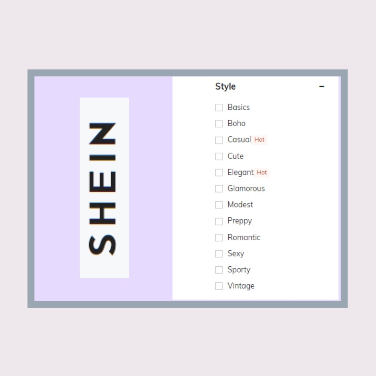
Thematic filters at Shein included a variety of different options, from the type of style to occasion. However, we noticed a problem with the language again: some of the descriptions were too similar.
A user may struggle to know the difference between “glamorous” and “elegant”--or what exactly “vintage” entails.
Learn more about different types of search intent and filters here.
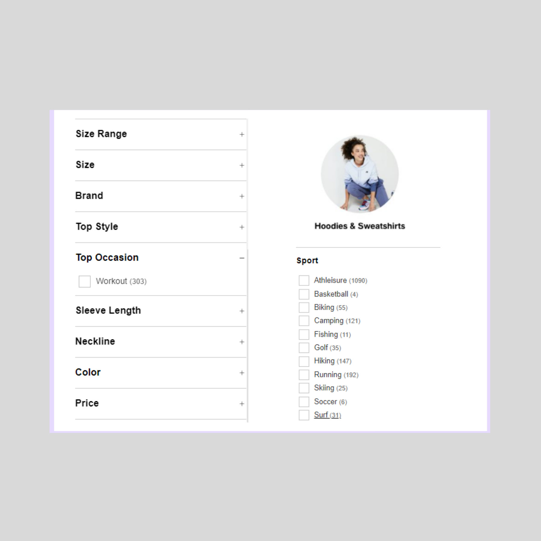
At Macy’s, the thematic filter options for “tops” lacked options–users could only select a “workout” top. However, there was another section of the website, under “activewear,” that had more t-shirts that we thought were appropriate for March madness, and offered filters based on sport.
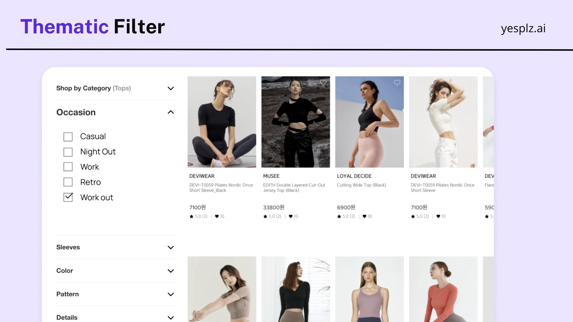
At YesPlz, we found thematic filtering categories such as “casual”; “night out”; “work”; “retro,” and “workout.” Users aren’t overwhelmed by too many options–and it’s clear where to find the filters (under “Occasion”). We’ve seen other thematic filters listed under “Style” or “Type,” which again, is confusing language for shoppers
Contact us to learn more about product filters
Not all product specifications need to be included in the filtering process–in fact, when there are too many product specifications, the search process becomes overwhelming (particularly with text filters).
We recommend adding key product specifications–and based on internal interviews that we conducted, price and size are the primary specifications that users care most about when shopping.
Shoppers are also extremely particular when it comes to fit–many want to hide or flaunt a specific part of their body. So, with this information in mind, search filters should include style attributes related to fit–and those attributes should be easy to understand to make the filtering process faster.
Material is also important to shoppers: because of the lack of a sensory experience when shopping online, shoppers want to know what kind of material they should expect.
We learned that shoppers also value style attributes such as neckline, sleeve length, color, and pattern. And because it’s difficult to discern sizing or style online, users also like to see customer reviews to guide their journeys.
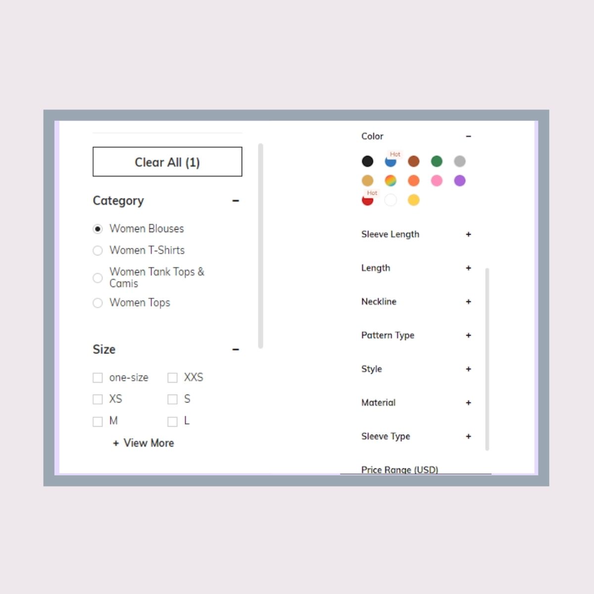
At Shein, key product specifications are offered in filters such as fit, length, and neckline. The “size” filter sits at the top, which is useful for shoppers who want to quickly filter their sizes.
Within each product attribute category, there is an overwhelming number of attribute details. This could be related to product tagging, when third-party retailers individually provide product information, leading to duplicate or similar names for the same product details.
Another important attribute, price, sits at the bottom of the filter, forcing users to scroll down, then back up to apply price filters.
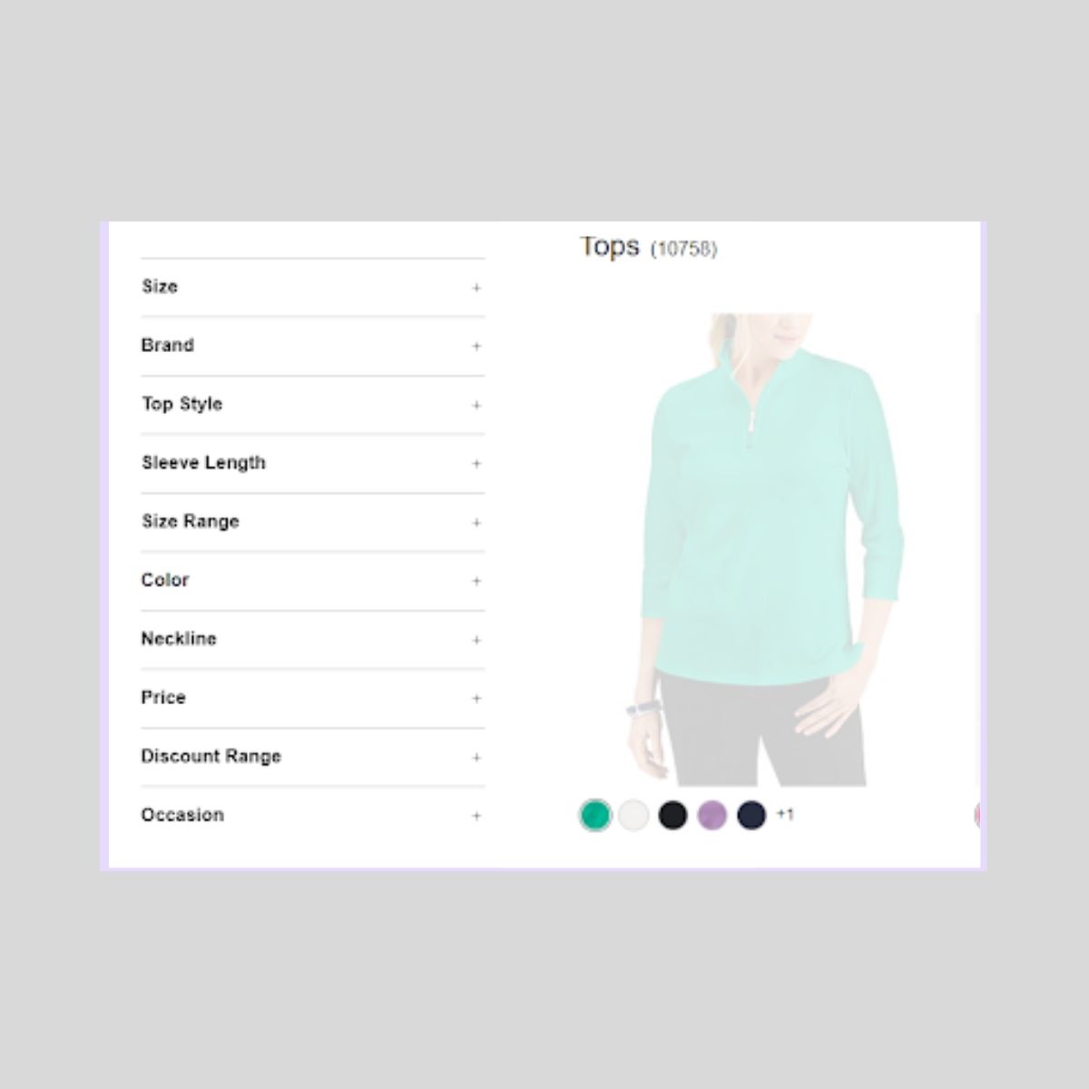
At Macy’s, the size filter is prioritized at the top, making it easy for users to select their preferred sizes. However, there are no options for filtering by fit, an important product attribute for users.
Similar to Shein, there are dozens of text details within each category to further describe product specifications. While useful for the sheer amount of information and details, the filters include language that could be confusing for shoppers–for example, a “mock neck” or “split neck.”
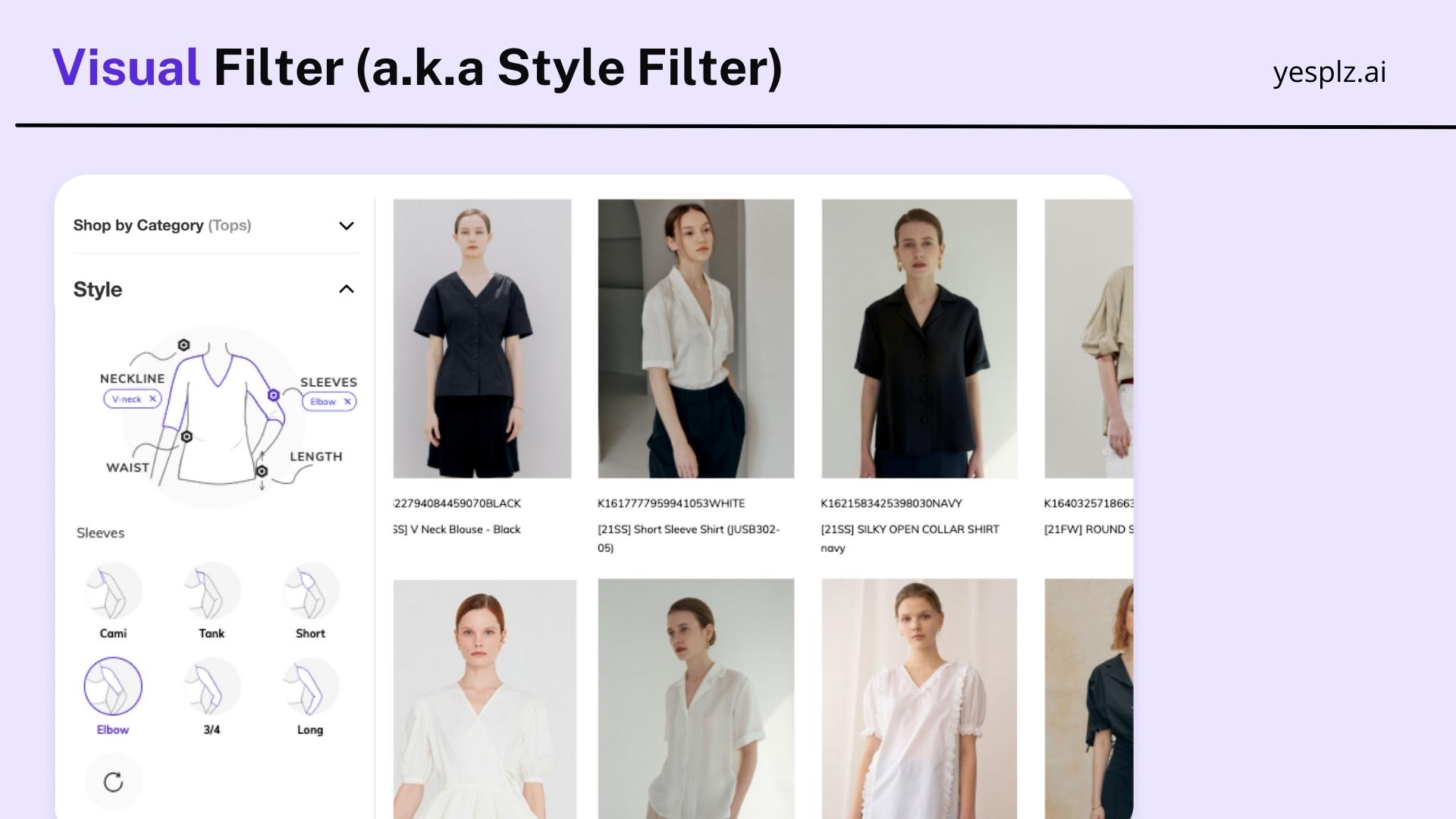
At YesPlz, the key product attributes are mapped on a virtual mannequin. When a user clicks on the name of the product attribute on the mannequin, she can view more details about the specification. This allows the user to easily filter for her preferred attributes, without needing to decipher long lists of text.
Product filters should include clear navigation to keep users engaged with the site. If a user becomes frustrated with the site due to poor UX, she will bounce.
But, what exactly does clear navigation mean? We define it as:
-Easily adding and removing filters
-Viewing applied filters at the top to get a brief overview of selections
-Showing users their preferred categories at the top of the filter
-Hiding dead-end searches
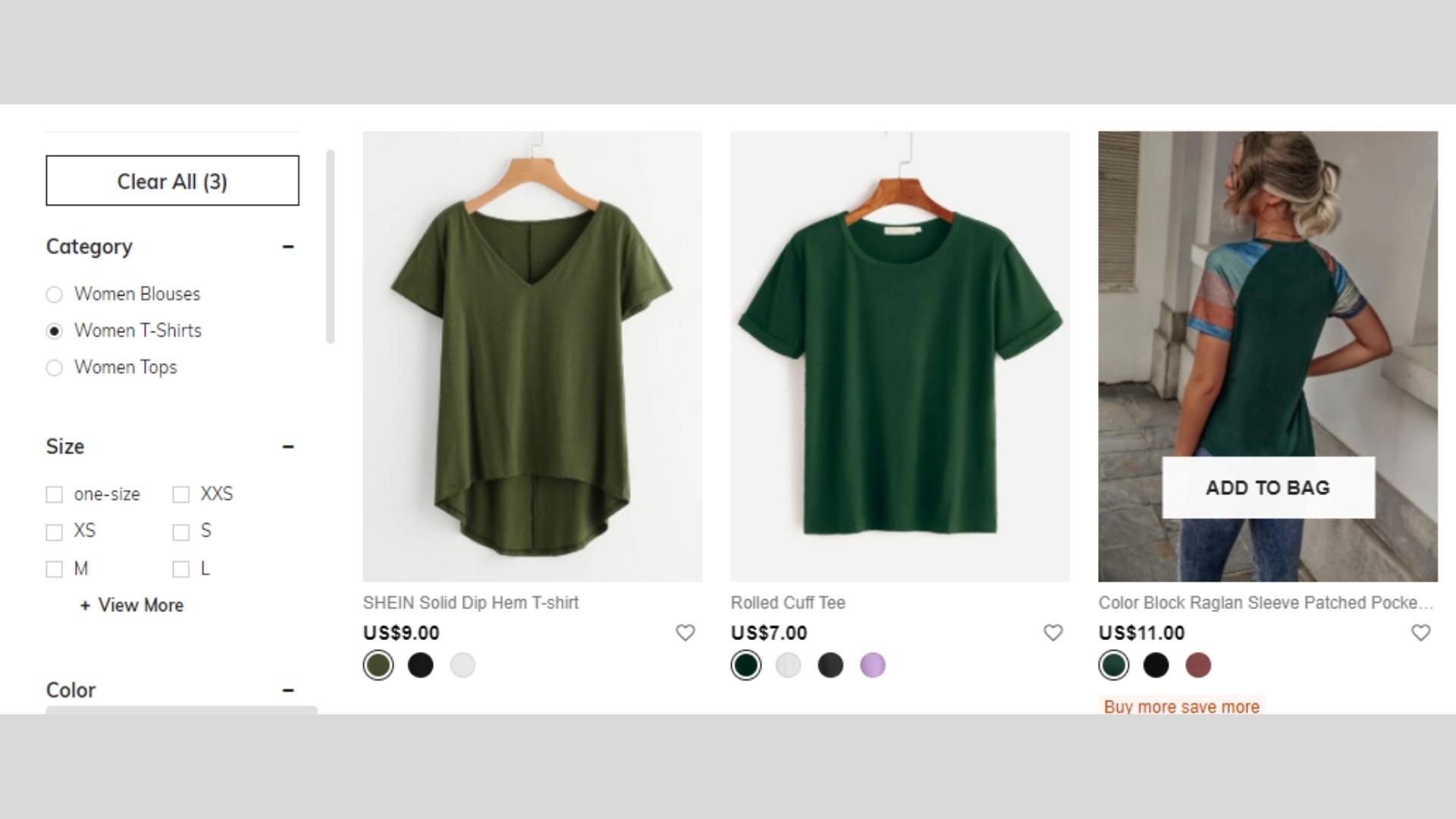
We searched for a green t-shirt in a size large. Unfortunately, we couldn’t see the selections at the top of the filter, and only had the option to “clear all,” so we were forced to scroll down to select and de-select filters.
The trash can icon was a helpful visual cue to clear filters within each category.
Overall, the navigation experience wasn’t clear or seamless. We were required to scroll up and back down to continue searching–and each time we selected an item, the page would re-load, making search results quite slow.

We searched for the same green t-shirt at Macy’s. It was helpful to see the filter selections at the top of the search results (t-shirt, green), so to easily de-select one filter at a time.
The language between Shein and Macy’s was different, which required double-checking and re-examining filter selections, making the navigation process more difficult.
In addition, the filter options weren’t truncated, requiring the user to navigate through large blocks of text to find her selected options.
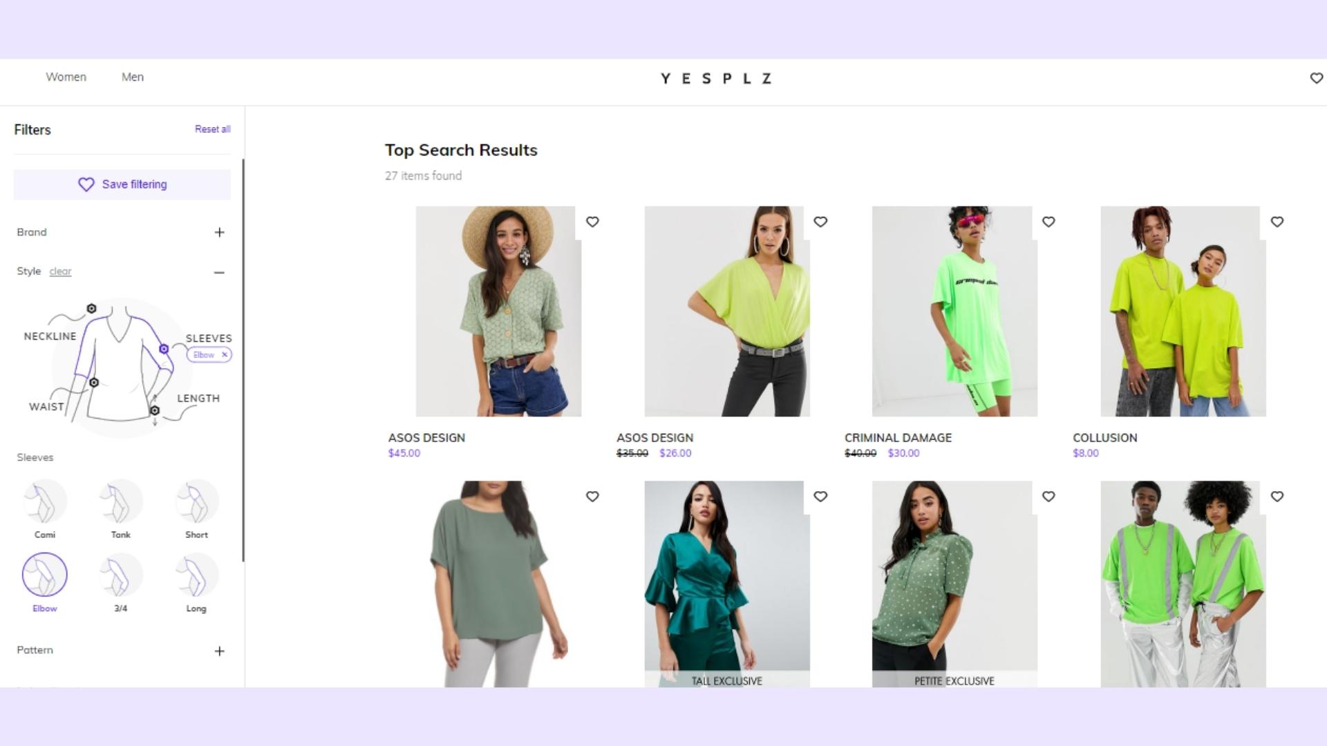
At YesPlz, there is no need for users to scroll long lists to select or de-select filters. By using a virtual mannequin, different filter options are displayed by clicking on the point on the mannequin.
It would be helpful to be able to remove filter options at the top of the search results, similar to Macy’s.
Overall, by excluding text filters, the user can easily navigate through different filter categories to find what she’s looking for.
Our final tip for product filter and search: include advanced filtering interfaces. This can include faceted search, different filter configurations, and separate UX for mobile and desktop.
Faceted search goes beyond including product specifications in search–rather, it allows users to further narrow down search results in a mutually inclusive way, instead of seeing results one value at a time.
For example, if a user searches for a “leopard print, long sleeve top,” she will see leopard print tops with long sleeves. Without faceted search, she will see either leopard print or long sleeve tops.
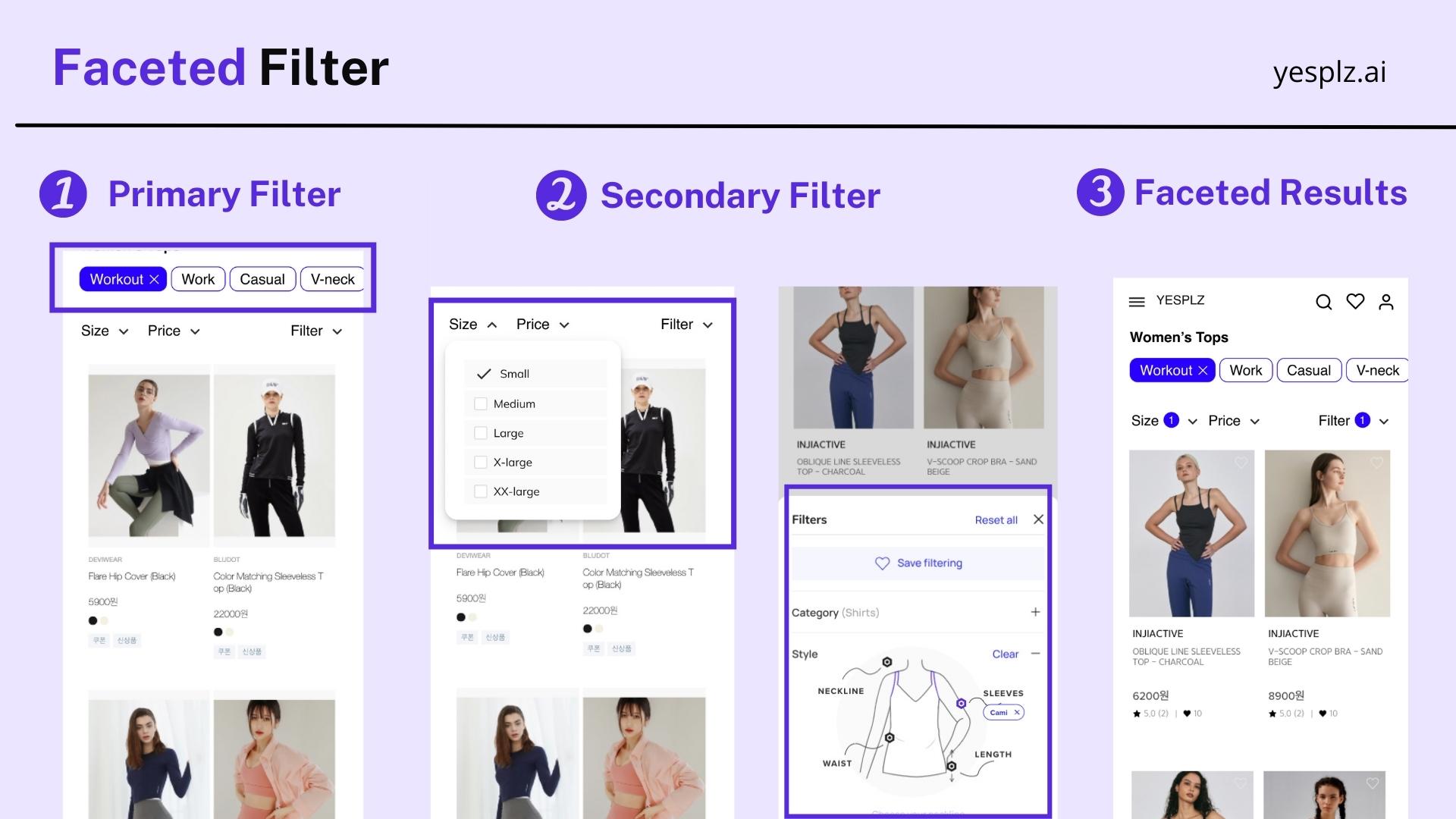
By allowing more complex filters, shoppers can get closer to what they’re looking for, and are less likely to drop off during the purchase process.
Other advanced filtering options include creating different filters for mobile and desktop. With over 50% of eCommerce searches taking place on mobile, it’s crucial to optimize search filters for smaller screens–and that often means making tradeoffs, such as showing only the most important filters or re-sizing filtering tools.
On desktop, there is an expectation that search filters will not require users to toggle back and forth between the product filter and search results–yet on mobile, non-optimized product filters can take up entire pages and force users to choose between the filter and search results.
Let’s explore how Shein, Macy’s, and YesPlz approach advanced filtering.
Schedule a free consultation to learn about filtering

Users can easily select filters from horizontal options on top, but if they want more advanced filter options beyond color or size, they need to click to open a vertical filter. We think the horizontal filter at the top is a great addition, and something unique when compared to other filters.
On a small screen like mobile, it was difficult to read all of the text options and information available, which didn't create a memorable search experience.
Most importantly, Shein's mobile filter takes up the full screen, requiring a user to close the filter to view search results, and re-open the vertical filter to make more selections. This creates more friction in the shopping journey and could lead users to bounce off.
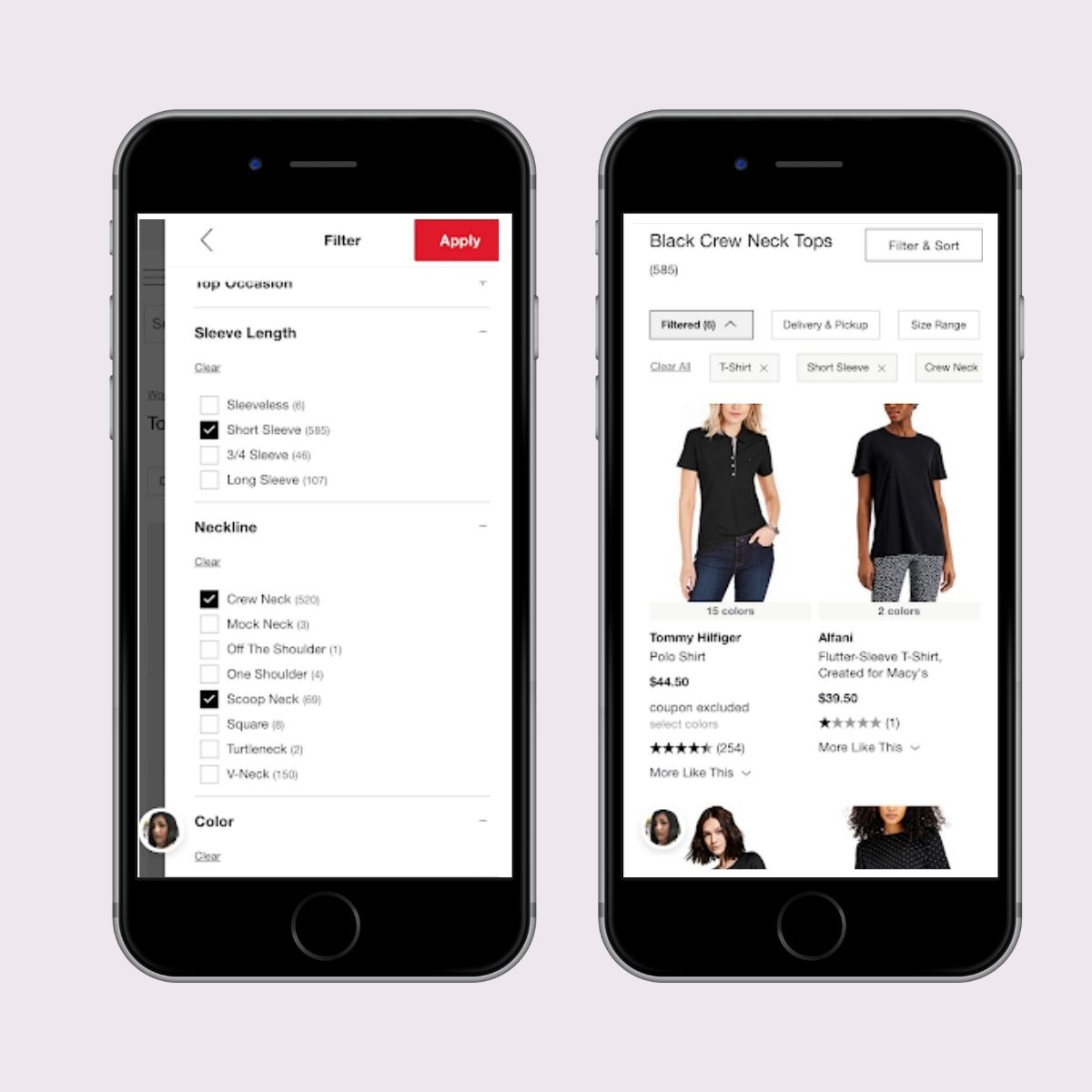
Macy’s filters lacked the ability to search and refine further within a category, making the overall experience frustrating. In addition, long lists of texts and a full-screen mobile filter were deterrents to the user experience. The search filter design was not optimized for mobile.
We struggled to know whether our filters were applied (users need to click the red “apply” button at the top right, or else their selections are cleared), and had a difficult time toggling back and forth between the long text filters.
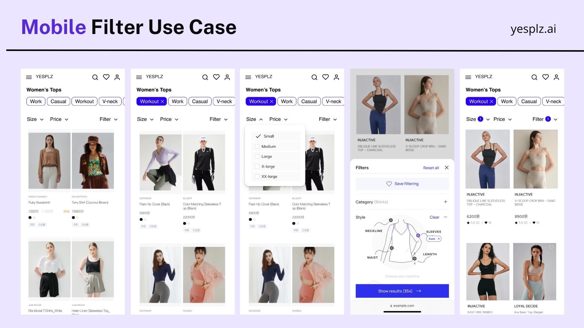
YesPlz is optimized for mobile, and offers an intuitive interface and experience. With specifically designed filters that perform well on small screens, users can make their selections while being able to preview search results–and can scroll without needing to collapse the filter. Through faceted filtering, users can quickly narrow down and select their preferred product specifications.
Learn more about fashion eCommerce
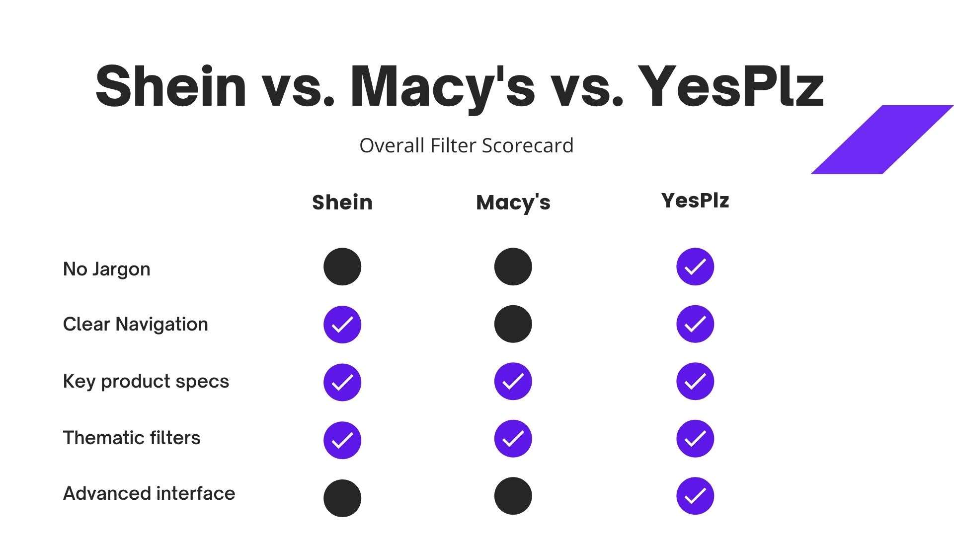
While there isn’t a “one size fits all” rule for product filters, it’s clear that there are best practices for eCommerce brands to follow, such as including thematic filters, easy navigation, and optimized mobile experiences.
The current search experience is frustrating and overwhelming–and the goal of product filters should be to make fashion search more intuitive and easy-to-use. Shoppers shouldn’t need to understand complex fashion jargon, figure out how to “apply” their filter selections, or toggle between search filters and results–the entire process should be cohesive.
Successful product filters require a combination of designing with intuition and keeping the user's needs in-mind.
If you're curious to go over the Product Filter Checklist for your own fashion eCommerce, contact us to schedule a free consultation.
Written by Jess Erdman
Content Marketing Lead
I'm passionate about creating cool content. The best part? I get to learn new things about fashion tech and ecommerce everyday. Have an idea or opinion about this article? Reach out at jess@yesplz.ai

Complete the Look, Shop the Look, Style With, or Bundle? Find out which outfit recommendation type fits your catalog, imagery, and conversion goal.
by YesPlz.AI

Fashion shoppers don't always know what to type, but they know what they want when they see it. Here's how visual search solves that problem for fashion retailers.
by YesPlz.AI